The Prosperity Paradox: Why It Feels Harder Despite Low Unemployment
Economics
Data Science
Published
February 1, 2026
The Big Question
If official unemployment is low, why does job hunting feel like a “war,” and why is poverty rising?.
1. The “Quality” vs. “Quantity” Gap
As we saw in our TRU analysis, the government counts you as “employed” even if you work 1 hour a week at a low-wage job. *The Competition: Population growth and automation mean there are more people for “high-quality” jobs, while “low-quality” jobs (that don’t pay a living wage) make up a larger portion of the market.
2. Poverty and the Cost of Living
To answer your question about poverty, we need to look at the Supplemental Poverty Measure (SPM). While the economy grows, the “Real Wage” for many has stagnated.
3. Why the Competition is Fierce
Degree Inflation: Jobs that used to require a high school diploma now require a Master’s. Automation: Entry-level positions are being replaced by AI, making the “first step” on the career ladder much harder to reach.
4. The Gap Between Headlines and Reality
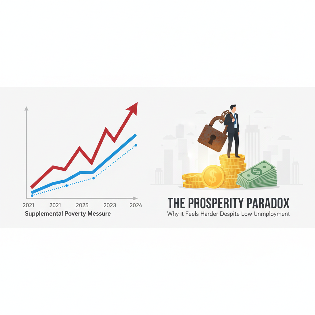
While official statistics often paint a rosy picture of the economy, many in Jersey City and across the US feel a growing disconnect. To understand why, we must compare the Official Poverty Measure (OPM) with the Supplemental Poverty Measure (SPM).
NoteKey Insight
The gap between the red (SPM) and blue (OPM) lines represents the millions of Americans who are technically ‘not poor’ by 1960s standards, but struggle to survive in 2026.
The SPM is a more “real-world” metric because it accounts for: * Government Benefits: SNAP, stimulus checks, and tax credits. * Necessary Expenses: Costs of housing, medical bills, and taxes.
5. Interactive Analysis: OPM vs. SPM (2009–2024)
“The Supplemental Poverty Measure (SPM) tells the story that the official rate misses: the rising cost of staying afloat in a modern economy.”
Click to see the Python code for this interactive chart
import plotly.graph_objects as go# Data points based on US Census Bureau historical seriesyears = [2009, 2010, 2011, 2012, 2013, 2014, 2015, 2016, 2017, 2018, 2019, 2020, 2021, 2022, 2023, 2024]opm = [14.3, 15.1, 15.0, 15.0, 14.5, 14.8, 13.5, 12.7, 12.3, 11.8, 10.5, 11.4, 11.6, 11.5, 11.1, 10.6]spm = [15.1, 15.3, 16.1, 16.0, 15.5, 15.3, 14.3, 13.9, 13.9, 12.8, 11.8, 9.1, 7.8, 12.4, 12.9, 12.9]fig = go.Figure()# Official Poverty Ratefig.add_trace(go.Scatter(x=years, y=opm, name='Official Measure (OPM)', line=dict(color='#1B263B', width=2, dash='dot')))# Supplemental Poverty Measurefig.add_trace(go.Scatter(x=years, y=spm, name='Supplemental Measure (SPM)', line=dict(color='#e74c3c', width=4)))fig.update_layout( title='U.S. Poverty Trends: Official vs. Supplemental Realities', xaxis_title='Year', yaxis_title='Percentage of Population (%)', plot_bgcolor='white', hovermode='x unified', legend=dict(orientation="h", yanchor="bottom", y=1.02, xanchor="right", x=1))fig.update_xaxes(showgrid=True, gridcolor='#F0F0F0')fig.update_yaxes(showgrid=True, gridcolor='#F0F0F0', ticksuffix='%')fig.show()
6. Why Does It Feel Harder?
Look closely at the red line (SPM) between 2021 and 2022.
The Pandemic Effect: In 2021, the poverty rate hit a record low of 7.8% due to massive government stimulus and expanded child tax credits.
The “Cliff”: In 2022, as those programs expired and inflation surged, the SPM jumped back to 12.4%, and stayed high at 12.9% through 2024.
This “jump” in the red line is why we feel poverty is rising, even though the Official (dotted) line says things are stable or improving.
Conclusion
We aren’t necessarily becoming “lazier”; the bar for survival has moved higher. Our TRU data proves that while people are “working,” they aren’t necessarily “earning enough to live”. The rising cost of living, degree inflation, and automation are making it harder to find quality employment that pays a living wage.